Search This Blog

Sunday, March 27, 2011

Shape and Volume - Negative Space

This weeks assignment was to create three negative space compositions using a chair and some sort of table as a still life. This is what I came up with

Before


After

Before


After

Before


After

Tuesday, March 22, 2011

Shape and Volume

"Find and post one example each of rectilinear, curvilinear, naturalistic, idealistic, abstract, and nonobjective shapes. Explain your choices!"

This week we are exploring shape and volume in art.  The assignment is to find and post one example of rectilinear, curvilinear, naturalistic, idealistic, abstract, and nonobjective.


Rectilinear-
Boxo3 by James Leese
 Boxo3 is a good example of rectilinear shapes. The term rectilinear is to describe the visual effect.  Rectilinear composition includes emphasize on right angles(often lending to sharp and angular feeling). Boxo3 has a focus on planes of color, and with a repeating pattern..., creating a rectangular painting.


Curvilinear-
Millennium Park Pavilion by Zaha Hadid, Chicago IL
This pavilion in Millennium Park is an example in curvilinear design because there is one continuous curve. The only straight lines found on the pavilion are wrapped around the piece. Curvilinear design often is associated with geometric shapes found in nature.


Naturalistic-
Boston Red Sox at Boston playing White Sox, found- Library of Congress Flickr
Naturalism may be easier to think of as visual realism.  Naturalism is more concerned with appearance and true to life representations of this.  The photo above is just that.  It is an honest appearance of the game at that specific moment.  There were no distortions or idealistic emphasizes added.


Idealistic-
2001: A Space Odyssey, by Robert Mcall
 Idealistic art is just the opposite of naturalistic; It is how one wants to world to appear, not how it actually does.  In other words it is the artists view of the world improved with all the flaws, accidents, of the visual world corrected in their eyes.  I feel that Robert Mcall's painting, 2001: A Space Odyssey, is a cool representation of idealistic art.  It shows what how he see outer space and its interaction with us.  He creates it so it looks surreal, as many people imagine it to be.

Abstract-
Sweeny In Summer, Paul Resika, 2007-2008
Abstraction is the simplification of otherwise natural shapes to their basic shapes.  With abstract art details that would be essential in naturalism or idealism are ignored. It can be argued that all paintings are abstractions because no artists could possibly recreate every single detail found in the natural subject.  Abstraction deals with more the simplification of the obvious and elements that have importance in the piece of art. The painting Sweeny in Summer by Paul Riska shows little detail in the composition....; all of the elements have been abstracted to their basic form while still keeping them recognizable. Take for instance the sails of the boats, Resika simply made them isosceles triangles, but they are still recognizable with the reflection created showing that its water.


Nonobjective-
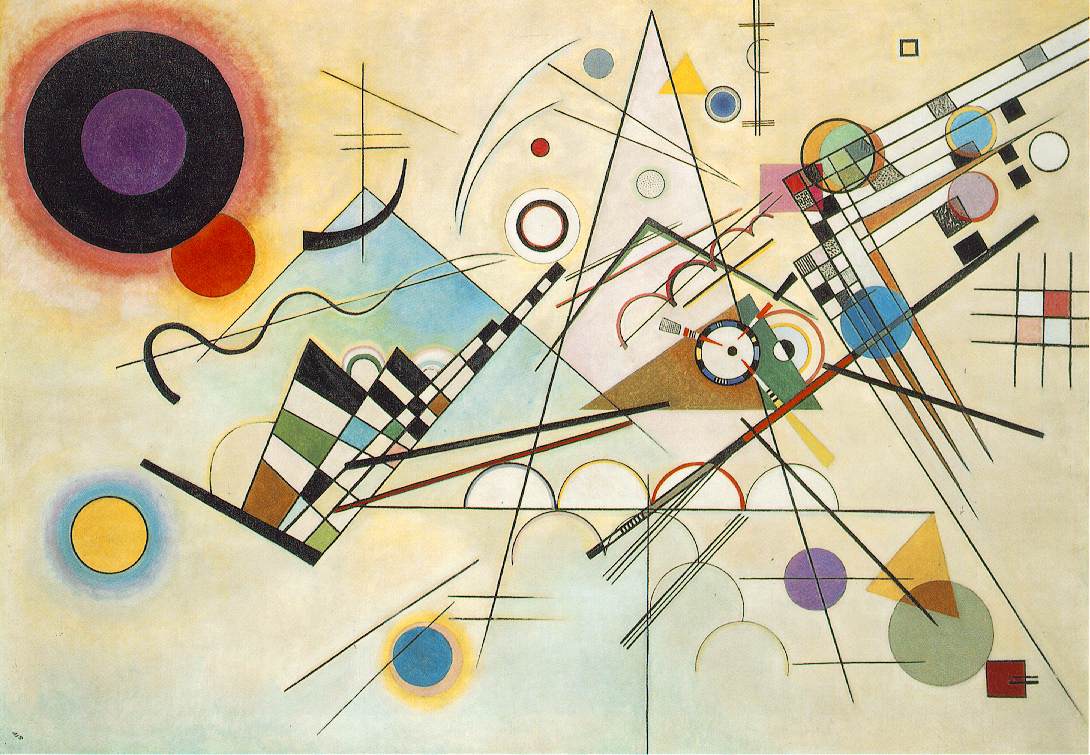
Composition VIII, Paul Kandinsky, 1923
Although it one might consider Composition VIII by Paul Kandinsky abstract art, but it isn't. This piece of artwork is a sample of nonobjective art.  The shapes in the art are not abstracted from a natural form or subject matter suggestion.  Although nonobjective art do not have subject matter human reflexes often associate shapes and patterns with things one finds in their environment.  Take for instance the painting by Kandinsky, there is no real subject but my eye associates some of the circles to suns, and I also see a horizon with sun appearing half above it.  In this way the artist can use the viewers eyes to make these associations even though it may be a nonobjective painting.

Saturday, March 19, 2011

Lines_Emotions_Verbs_Objects!

This week was especially fun.  We got to work with lines, and art has some sort of lines.  We learned about contour lines, how lines are used to make volume, gesture lines, and etc.  Lines, lines, lines? What's my line?

On to the assignment.

Page 1, Dry media:
  • Choose four different emotions and write each one in the corner of a square.
  • Fill each square with a different type of mark or line that relates to the emotion.
Page 2, Wet media:
  • Choose four different verbs and write each one in the corner of a square.
  • Fill each square with a different type of mark or line that relates to the verb.
Page 3, Dry media:
  • one contour drawing (follow the edge of the object)
  • one blind contour drawing (draw the object while slowly following the edge of the object with your eyes, but do not look at your drawing!)
  • Two gesture drawings, one in each type of dry media
Page 4, Wet and Dry media:
  • Fill each square with a "drawing" of your object that uses different types of line to express volume
Then, or before, one was to choose four different types of "media" (various mark-making choices like spray paint, charcoal etc, etc.) to make your mark: Two for the brush tool (wet media,) two for the pencil tool, (dry media.)  

Here's what I came up with!  I chose chalk round and pencil thin for the dry media. For the wet media I chose a grunge brush and a hand drawn vector brush. 

Here's the product. 

Page 1, Dry media:
  • Four emotion
  • Fill each square with a different type of mark or line that relates to the emotion.
Page 2, Wet media:
  • Choose four different verbs and write each one in the corner of a square.
  • Fill each square with a different type of mark or line that relates to the verb.

Page 3, Dry media:
  • one contour drawing (follow the edge of the object)
  • one blind contour drawing (draw the object while slowly following the edge of the object with your eyes, but do not look at your drawing!)
  • Two gesture drawings, one in each type of dry media

Page 4, Wet and Dry media:
  • Fill each square with a "drawing" of your object that uses different types of line to express volume


Thursday, March 17, 2011

Wk 5: Balance

This week we were to create a two part composition.

Part 1: Using interesting kitchen objects create a balanced composition using those elements.  The elements needed to go over the edge of three sides of the composition and touch at least one other object. I used a water bottle, learner's chopsticks, tiny spatulas, the heads of some other tiny spatulas, and two little salt and pepper shakers.

Positive
Negative
I'm not sure that I did the left overs correctly.
Leftovers

Leftovers- Balancing composition

Enjoy.

wk 4: Scale

This week the assignment was to create a collaged still life that had a sense of surrealism because of shifting scale.  The objects were to relate to each other.  I took pictures that I have taken over the past year and combined them.

Reflections

The low color contrast help to create unity in a somewhat busy piece of work.  I started with the sunglasses picture.


Then made it black and white.


I then selected the lenses of the glasses and added another picture I took while flying on an airplane. Then added a couple filters to it.

Next I added a picture I took of Chicago. I selected the main part of it and faded it out.

This is the picture of the Tuck and Zoey's tails that I used in the composition. I changed the mode to multiply for this.
Creating this retro-ish and reflective composition. 


Wednesday, March 9, 2011

Headshot

Jeanna at a friends graduation June 2010, Taken by O. Anderson
Let me start out by saying, I have fun trying to evade the camera.  If someone tries to take a picture of me, they're going to have to work for it (at least usually)!  I chose this photo because it shows the real me, playful and goofing off.  It says that I am fun and am happy where I am at.  If you saw the next photo taken of me... you'd see a huge grin and a playful sparkle in my eyes. This photo more accurately represents the me now than the past me. 

I don't dislike anything about the photo.  The lighting behind me adds interest while the colors, blue and browns, help to unite the photo together.  The photo is well balanced with my body more to the left and my head to right.  There is definitely a main focal point in the photo, as the viewers eye are drawn immediately to the camera iris.  Overall I would say it's a great photo that represents me and that moment in time. 

Sunday, March 6, 2011

Rhythm

Top right clockwise - ice, inferno, cool, hot
Icy - cold

This week we studied about rhythm in art and how it can stimulate one of our senses like sound, touch, taste, and smell.  The above picture is a rhythmic representation of a word symbolizing a sense.  The last is a progression and emphasis on the rhythm presented.